Kickass user experience – one solution at a time – the devil is in the details

We explored a few ideas on putting life into otherwise boring forms using conversational techniques: https://www.simpragma.com/blog/enhancing-user-experience-one-solution-at-a-time/
Practical life vs fairy tale
Every application design looks spic and span with very less number of fields in it. However, real life applications need a lot of inputs.
Stunning graphic designs provided by user interface designers look great on paper, much like a fairy tail. However, the practical user interface looks like our real life, we have lot of errands to run, in a little time and with limited resources.
Consider point-of-sale (POS) systems that is used by employees in all the retail stores.
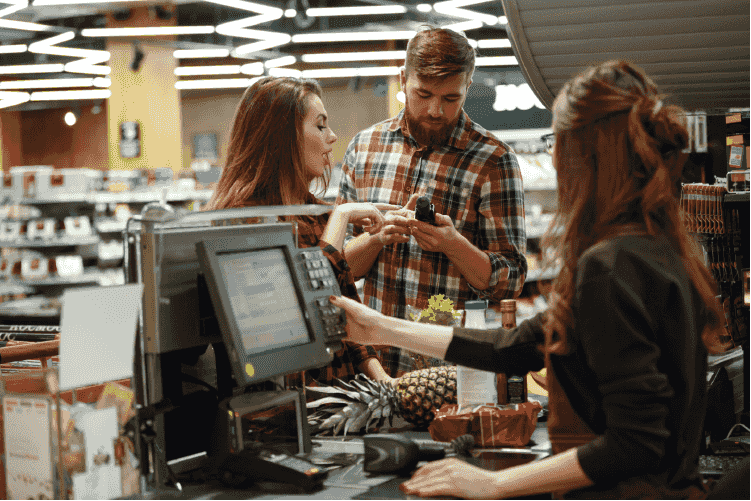
Just recollect your last visit to a convenience stores or a mall. The sales clerk at the counter looks at the same interface for more than 8 hours a day, 6 days a week, 24 days a month and all through the year. The point-of-sale system is used by tens of thousands of people working at retail stores all through the world day in and day out.
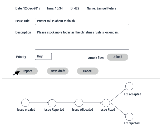
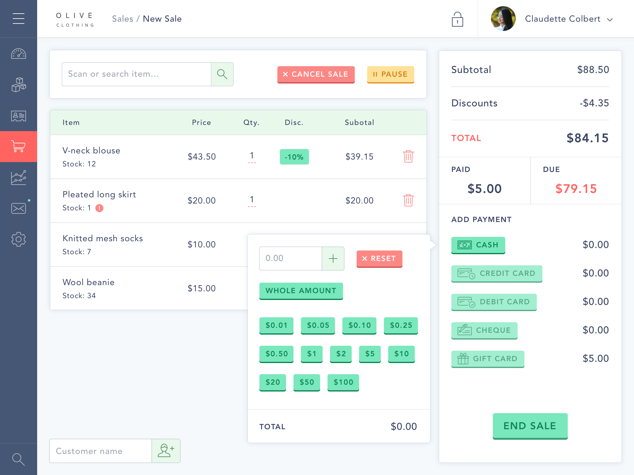 A graphic designer can provide a great-looking POS interface. Here is one of them. It has great colour, clean user interface, no clutter, minimal items and every aspect you would consider ideal for a great user experience
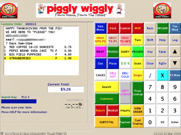
However practical POS will need a lot of sophistication and hence a lot of fields and buttons on the user interface. It will be almost like a pilots cockpit.
How do we provide a practical POS system while maintaining the aesthetics?
This is where micro-interactions can help. Micro interactions bring in intuitiveness subtle effects to user interfaces like the POS interface. This goes a long way in transforming user experiences.
Solution #3 – Micro-interactions – The devil is in the details.
 POS interface has lot of details. It expects a lot of actions from the clerk at the counter. The clerk at the counter gets so lost in the details, because of too many items, too many fields, too many customers, too long a time and too much of attention needed since money is involved.
In this clutter of information littered over bits and pieces all over the monitor, focussing on the information that is currently required will ease the life of clerk and improve productivity for the retail company.
POS interface has lot of details. It expects a lot of actions from the clerk at the counter. The clerk at the counter gets so lost in the details, because of too many items, too many fields, too many customers, too long a time and too much of attention needed since money is involved.
In this clutter of information littered over bits and pieces all over the monitor, focussing on the information that is currently required will ease the life of clerk and improve productivity for the retail company.
So let us get into the details. Have a careful look at the items present at the POS interface:
Micro interactions will provide the clerk just in time information in form of toaster message, like the action that needs to be take next like:
• Scan next item
• Check the UPC number here
• Warn hazardous item
• Get phone number
• Ask for bag
Toaster message flashes for few seconds and vanishes by itself. It does not require the close the window. It helps get a useful information at the right time.
Micro interactions help users visualise effects of their actions. So when a POS clear opens a cash box, since the cashbox is right below the monitor, the clerk at the counter instantly sees the effect of his/her action. However, if the clerk performs another action like intimating the admin department that they need more paper for printing receipts. How do they visualise this?
Micro interactions help users visualise impact of actions.
A subtle effect with an icon of paper roll and fact that it is already notified, will take away a lingering item off one of the items of botheration.
How will the clerk know that that the current sale is cancelled? Perhaps, a picture with “Cancelled” seal perhaps right on the monitor at the list of items in the order will give the right visual effect. And now the clerk is sure that the order is cancelled.
Micro interactions help switch mind at change of context:
Imagine that the clerk is in checkout, then he/she is not able to get the barcode of an item bought by the customer. So he/she needs to pause the system, call someone or run around to know the barcode.
Once the system is paused, the POS is in a different context. It is now in a locked state. It is now locked due to unavailability of bar code. How does the clerk visualise this?
Imagine that a customer is at the counter. The clerk asks if the customer is enrolled for loyalty card. The customer replies that he/she is not enrolled and is interested to enrol. Now the clerk has to switch the context from checkout items to enrolling the user.
If enrolling the user, had a button that had a different colour then all the buttons used to check-out item. If clicking of this button lead to change of colour of the whole monitor leading to user enrolment interface, then this helps the clear to physiologically switch the mind to a new activity.
Micro interactions help visualise progress and rewards users for steps taken.
Imagine that the POS clerk has to perform certain actions at the end of the day. The first item to be accomplished is to print out the Cash Transaction Report. This report lists each cash transaction that occurred during the day. This report is used for the purpose of detecting cash transaction mistakes if any. The clerk then needs to count the money in the drawer. The clerk then needs to reconcile the amount present at the beginning of the day, with the total sales made in case and the total cash left in the drawer. There may be more such steps. Micro interactions can here help the clerk to visualise each task. Cheer the cleark on completion of every step to keep the motivation on after the end of a another hectic day.
Micro interaction is about psychology
In effect micro interactions are not about basic utility, they are about synchronising with the psychology of users. That’s the reason they go a long way in enhancing user experience. Basically micro-interactions help to indicate:
• Completion of tasks
• Progress made
• Change in status
• Change in context
Industry support for micro interactions:
Material design takes into account micro interactions. Style sheets implementing material design have ready effects to use.
Check out this to view some micro interactions.
A few examples of Micro interactions
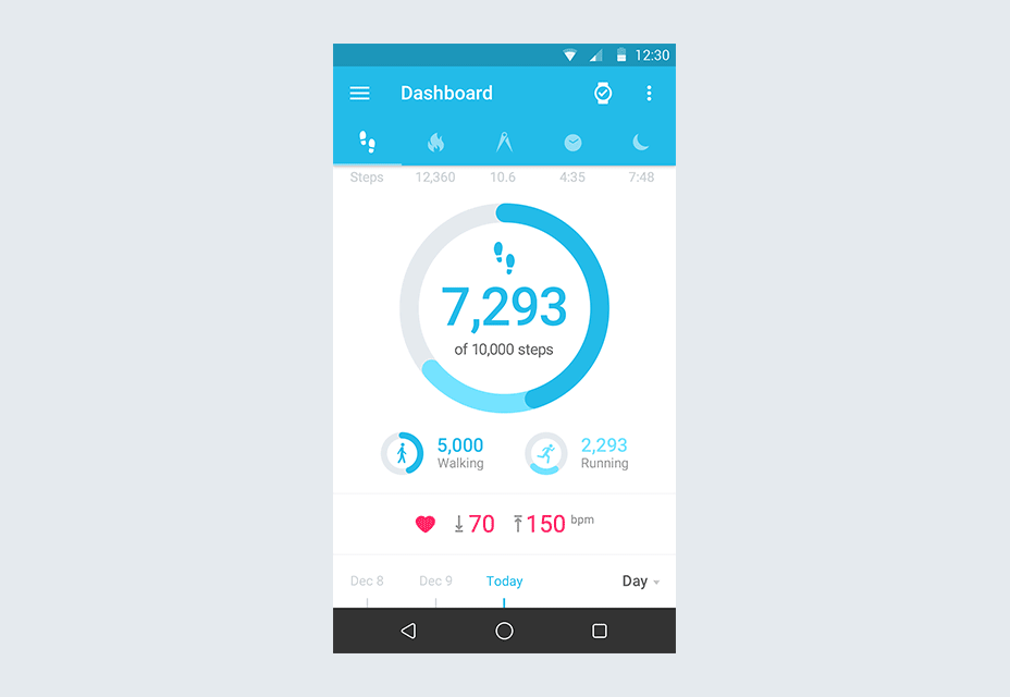
Here are some micro interactions on mobile devices:
A few stunning examples of Micro interactions on Mobile devices
Micro interactions at Simpragma
Our focus has been on micro interactions for long now. We built a lot of desktop and mobile interfaces using techniques provided in micro interactions.
Here is a short video of an app demonstrating micro interactions.
Micro interactions by Simpragma
Do you want to create some stunning user interfaces with a difference? We at Simpragma, would love to interact with you to explore the opportunities for you to use micro interactions in your applications.
Last few words of advice:
In todays user interfaces, folks are used to great experiences. Their expectations have raised. Markets are full with applications that have great user experiences. The attention to details does not constitute the design, the details themselves are the design.