Kickass user experience - one solution at a time - cut the crap


Lengthy is not Trendy

However, you see a problem. Your portal and app requires a lot of inputs from users to register? Suppose you wanted the user to enter more than 10 pieces of information like name, age, date of birth, e-mail ID, passport number, gender, marital status, weight, food preference, nationality, address and so on.
So get yourself into the shoes of users? Would you like to work so hard to register and try out an app? One of the reasons why whatsapp became so popular was its simplicity in on-boarding users. Here is some interesting statistic on number of fields in form effecting the conversion rates from visitors to registered users.
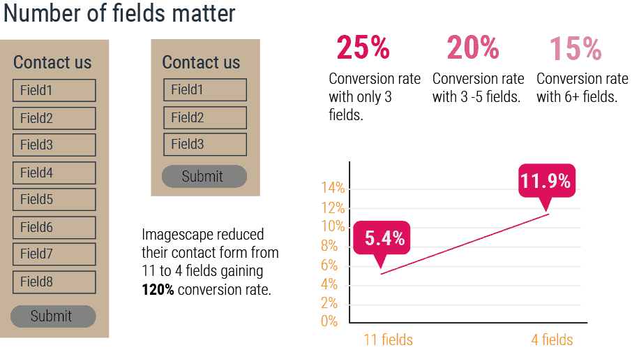
So more the number of fields, lesser the conversions! Visitors expect to fill less than 3 fields to be converted as users.
Does it put an element of apprehension in you? Will your users reject your app? On the other hand, if you do not collect the information, then your service will not be very relevant to the user.
Here is an opportunity to simplify.
Solution#1: Simplify
You can first fix the fields that do not require exact value. Let's consider weight. Do you need the exact weight, or you just need the build type like slim, stout and athlete body. You then just put icons for each body type and have the user just click the body type. So this will take less than a second than entering the weight that could take few seconds.
There are a few fields that can be read from social media accounts like the e-mail address.
We were able to reduce registration time for a fitness app that needed user to fill 18 fields, from over 5 minutes to less than 40 seconds.
Do you have some scenario that needs simplification, we at Simpragma will be glad to help you simplify your lengthy forms.